| THIS PAGE IS GRAPHICS INTENSIVE AND WILL LOAD
SLOWLY
The borders below demonstrate ways of giving side-bordered
backgrounds a continuous look, Bordered backgrounds look best if the image at the
left appears to be continuous. Repeating a Each comment refers to the graphic above it.
|
 |
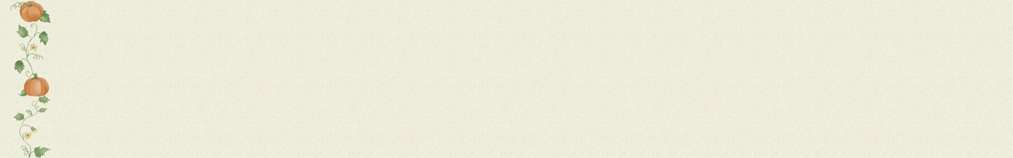
and flowers make the border look continuous. In actuality, the artist only needed to split one flower over the seam. Also, that is one flower repeated over and over again, but it looks like different flowers because it is in different positions, it is mirrored, and it is in different colors. |
 |
varied (artist: Cindy's Heartworks ). No connection of graphics over the seam is necessary. |
 |
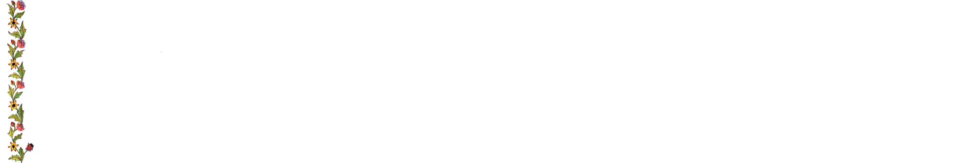
(Countryside Heaven) reduces the monotony. She only had to worry about connecting the stem. |
 |
two ways: by making the image high (so that it doesn't repeat as much), and by varying the positions of the elements. There is no connection of the graphics over the seam, but it looks as if there is.. |
 |
monotony to a minimum, and she only had to worry about connecting the string. (For you artists who like to do bird houses, consider putting three or four birdhouses on one continuous pole.) (Artist unknown.) |
 |
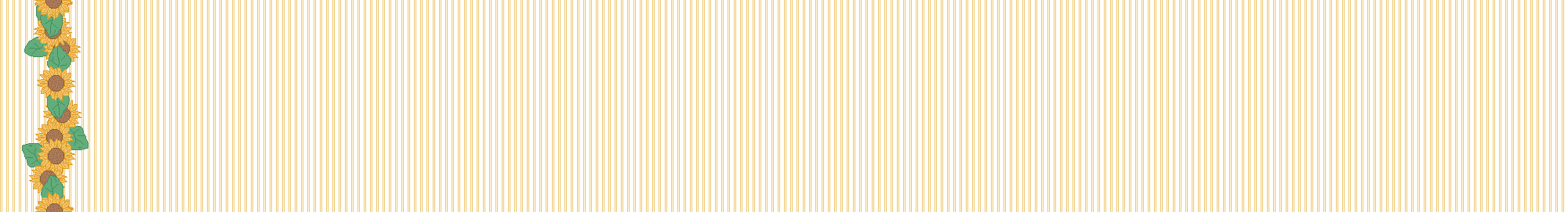
over and over, but it works because it is tall and slender and has a uniform width from top to bottom, which helps to make it look continuous. |
 |
geometric shapes (the triangular dots), vertical lines (the purplish-red and brown stripes), and varied natural elements (the flowers and leaves). It manages to be both symmetrical and complex. Even more surprising, it is composed of only line art and colors – no shading or gradations. |
 |
 |
connects over the seam. |
 |
the seam (Purple Woods, one of my favorite artists). |
 |
directions. This technique works only with simple images. (Artist unknown.) |
 |
two groups of leaves going in opposite directions. Aside from stems, strings and poles, other connecting images could be a lattice, a thin branch, a slender tree trunk, a string of yarn, and an electrical cord with Christmas lights. |
 |
lengths of stem can create a continuous border (artist unknown). Notice that each pair of leaves seems to grow out of the flower below it – there are barely any stems visible. I would love to see a good country artist take a crack at this design using blue and lavender flowers. |
 |
When tiled, it also appears that the stem at the bottom is coming out of the leaf below it, though there is no connection over the seam. (Artist unknown.) |
 |
of three vertical bars. All the artist had to do was to connect the bars. The use of colors is very original. (Artist unknown.) |
 |
Karen S. Nicholas has drawn these Celtic biting animals (dogs? dragons?) with a pleasant symmetry. The image has a consistent width and complexity from top to bottom, thereby making repetition an advantage. The image is also high and therefore repeats less. As you can see, there is no connection over the seam, although it looks continuous when it is tiled. |
 |
the stems pass down next to the flowers below, giving the border a continuous feeling. I highly recommend this technique of overlapping an image side-by-side. I wish more artists would attempt to duplicate the look of water colors. (Artist unknown.) |
 |
graphic of four leaves applied twice in two different positions and shades of green. |
 |
was the stem. However, the stem is fat and has leaf-like projections, making it harder to connect than a skinny stem. Even so, the technique is simple: Draw the connecting part of the graphic (the stem), then apply it to the top and bottom of the image, then remove the excess at top and bottom (using "canvas resize"). Just be sure that you put the top and bottom images in the same position horizontally. |
Karen S. Nicholas). |
 |
Indeed, all she did to make the border was to take a flower image and a leaf image and overlay them (isn't that cheating or something?). The border would have been more interesting if she had used two different flowers and two different leaves, or if she had added a stem. |
 |
the daisies above, all she had to do to make it continuous was to split one snowflake. |
 |
discrete elements than the others in this list. Several discrete images of grass are split by the seam. But once you've learned the technique of laying an image across the seam, why limit yourself to just one? |
 |
the seam. |
 |
 |
put the sun on a continuous, plaid background, which relieves some of the monotony. It also helps that the sun and the plaid background are similar colors. If the background had been, say, green, the repetition of the sun would have been more obvious. |
 |
woodwork is pleasing. The monotony has a mesmerizing effect. The more "classic" the shape, the better. (Artist: Grapholina) |
 |
images which suffer when they are repeated. |
 |
good when repeated. To make it more interesting, the artist reversed the design and applied it a second time in different color. No connection over the seam is required. |
 |
and over again. The irritating repetition is made worse by the frame around the jewel. In this case, there are other mistakes as well. The jewel should sparkle, but it doesn't, and the blue of the border is not a good match. Also, in web art, photographs will never be as appealing as art is. |
| I wanted to include more examples of what not to do, but I don't want
to offend or hurt too many people. But we've all seen it: the image of a cute puppy, bear or angel repeated over and over again, ad nauseum. Putting a frame around the image always makes the repetition more obvious. Even worse is repeating a miniature scene over and over again, such as a woman at a mirror. In short, a complex image must have a consistent top-to-bottom width to be repeated successfully (which an oval doesn't), or the image must have a variety of elements or a very simple design. |